Poster Side of Flyer..
Information Side of Flyer..
|
Poster Side of Flyer..
Information Side of Flyer..
0 Comments
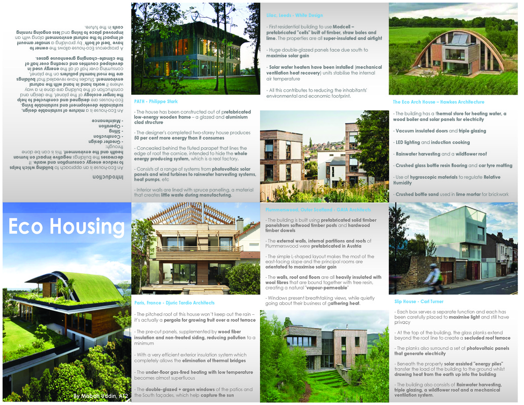
Info Side of Leaflet..
Poster Side of Leaflet..
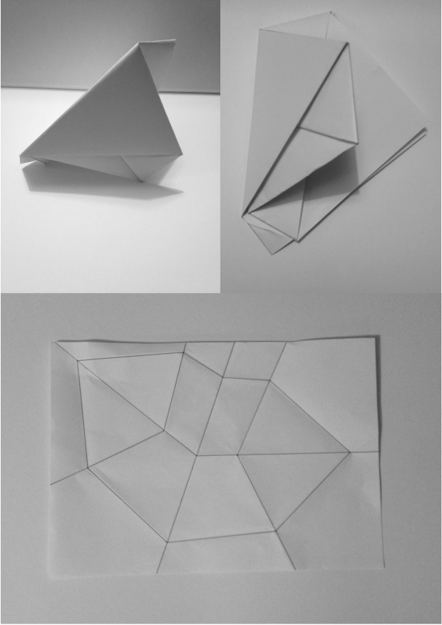 Folding Concept 1.. 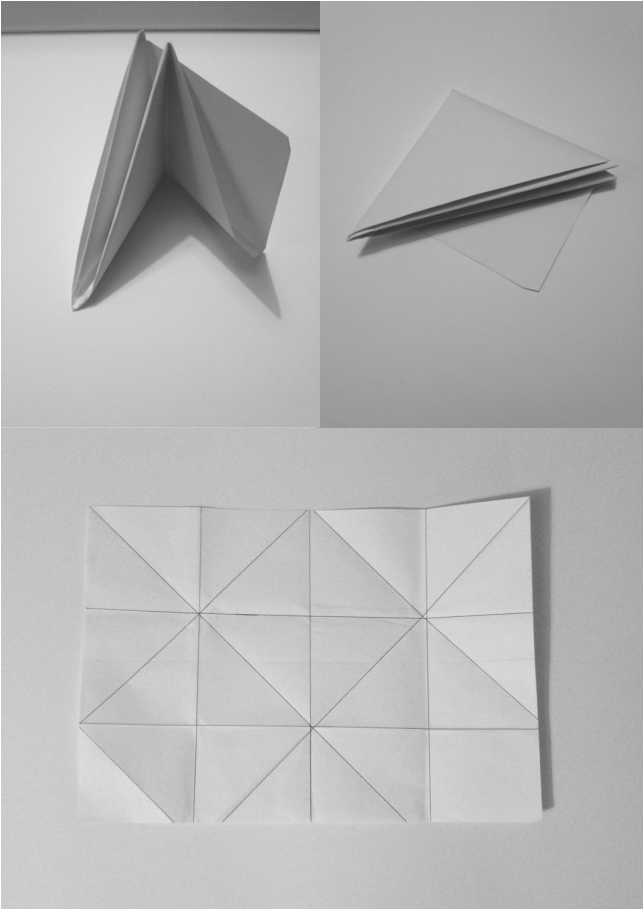 Folding Concept 2.. 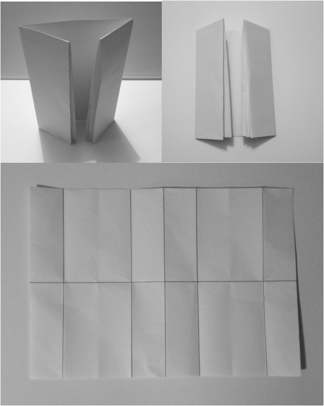 Folding Concept 3.. Out of all 3 concepts I did prefer concept 1 as I liked the overall form of the leaflet and felt it was most interesting, however I reaslied that I would struggle to include images and text, and the folding didn't really flow.
I do like concept 3 even though its very simple I feel it is quite elegant and could look quite professional, I wouldn't have a problem inserting images or text as it consist of a very simple layout, so I think I will go with this concept. So for the Shock Of The New Module we have been asked to create an A3 leaflet which is to be about a contemporary designer, technology, or movement which we are interested in. We have been told that we can fold the leaflet to whatever shape or form desired, however the outcome should be at least an A5 size. The flyer must clearly define our chosen topic through images and text. What was clear was that the leaflet is to be more about its content as opposed to its design, as the content is what we will be marked on. However there should be more images as opposed to text, the text should be kept to a minimum. So the best way to do this is bullet point or bold the important key factors. 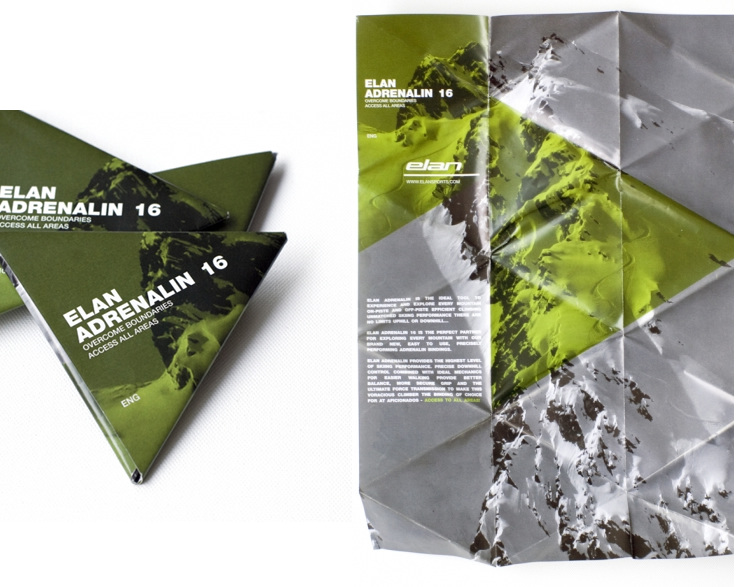 This was an example of a flyer shown to us, to help inspire us.. Personally I did find the flyer intriguing, the folding aspect was very interesting. The use of two main colours and how there isn't actually that much text however it was clear to understand the subject being promoted.
|
Recent PostsBusy, Busy, Busy! Categories
All
Archives
January 2016
|
 RSS Feed
